Custom Features Available
Additional Data on Hovering
In some columns on ENCOR Dashboard screens, hovering over a value displays additional details associated with the record.
Example: On the Dashboard screen, hovering over a trend icon displays additional information about a particular trend of the hospital, the type of trend, or if a downward or upward trend is better.

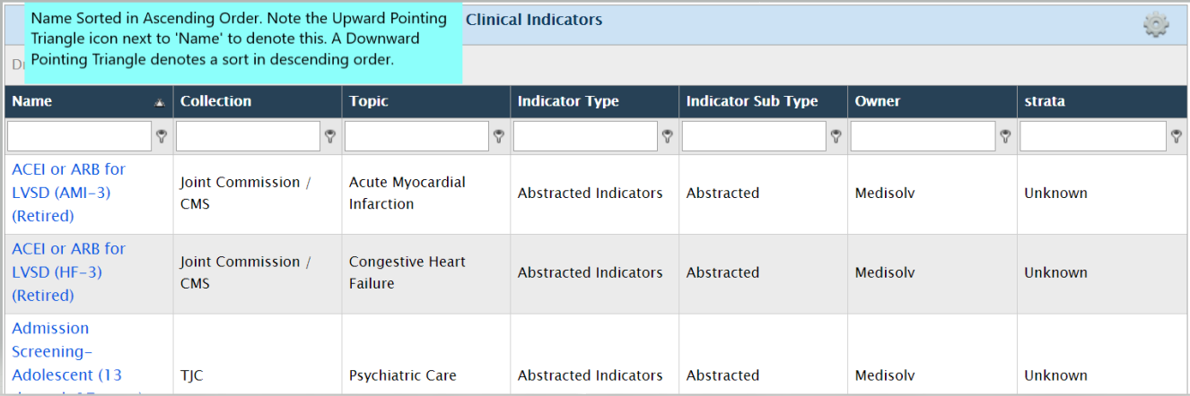
Sortable Headers
On report pages or screens, the column headings act as toggle sort buttons.
Clicking on the header once will sort the report section in ascending order of that field. Clicking on it again will sort the table in descending order.
Custom Icons
The ENCOR Dashboard grids typically enable users to manage records i.e. users can create new records, and edit or delete existing ones.
The custom icons displayed in the next image can be viewed on all grids that allow these functions.

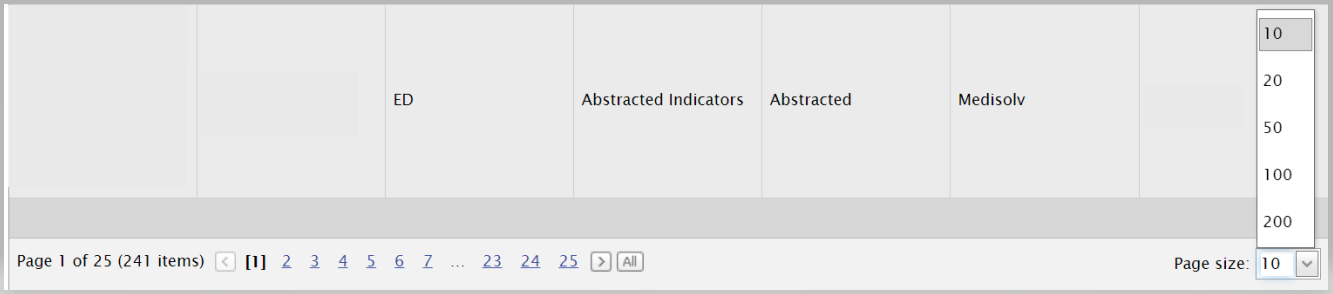
Pagination
Pagination options are provided on screens that display tabular data. These options located at the bottom of the grid enable you to navigate to the page number you require.
You can also change the page size by selecting to diplay 10, 20, 50, 100 or 200 lines per page.
Grid Filters
Report level filters help in selection of data for particular hospitals, categories or time spans. Once a report is generated, you can filter the data by specific fields on the grid to view only results that match your set criteria.
Filtering is enabled through the textboxes provided below the header row of the grid. Enter a full or partial phrase in a textbox to filter the displayed data by the values you entered.
Example: If you enter “AMI” in the Indicator Name text field, it displays all records, where the Indicator Name comprises of the phrase "AMI".
Other conditions for filtering the list can be selected by clicking on the Key icon beside the text box.
Example: Clicking on the Key icon near the Indicator Name textbox displays the filters allowed on the text field, including Begins with, Contains, Doesn’t contain, Ends with, Equals, Doesn’t equal.

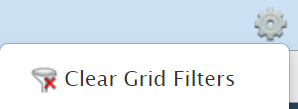
To clear the data filter, select the Clear Grid Filter icon under the Gear menu. Clicking this option displays the grid with all report filtering removed.
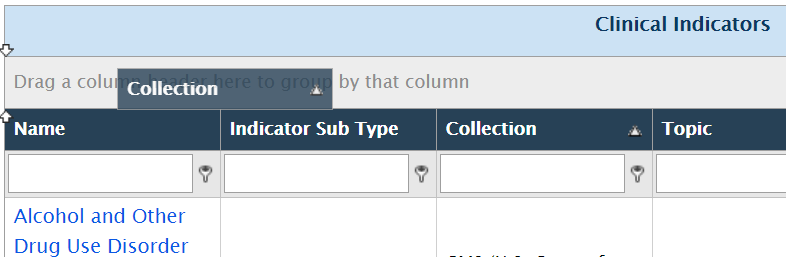
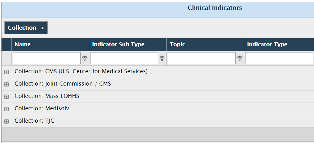
Grouping Data by Dragging/Dropping Column Header
Grids such as the Indicators or Manage Meta Data enables grouping together of displayed data.
The grouping option gives you a different way to aggregate the underlying data.
To group the data, drag a column header to the area at the top of the list. A set of double arrows appear, indicating where the column will be placed.
Dragging a column header to the grouping area causes the display to change. The data is aggregated by that column and redisplayed.
In the screenshots below, the results are being grouped by the Collection column. Once the action is complete, the display updates to show indicators grouped by the collections they belong to.

The Indicators on the Dashboard are represented by 4 different colors and respective shapes depending on their performance as seen in the figure below. Color-coding is assigned from the Goals set in ENCOR Dashboards.

The Color Coding of the Indicators are represented in the Dashboard as shown in the next image.
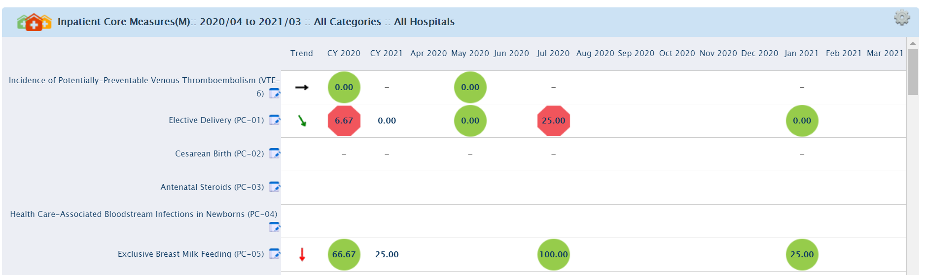
The same Dashboard screen also displays Trend Indicators in the form of colored arrows.
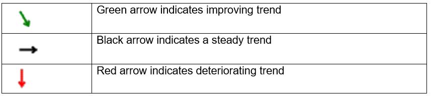
The Trend is calculated based on Metadata Trend selection and slope value. While calculated trend determines the angle of the Arrow, the Trend value determines the color of the arrow. The Dashboard screen uses the same color coding that is available across all Medisolv products. The color coding of the arrow is defined by the trend value calculated.
On the Dashboard screen the Trend (Arrow) provides users an outlook on the performance of an indicator over a specified period of time. The Metadata parameters define the favorable performance of an indicator i.e. it can be either higher, lower or unknown. The three aspects of the Trend (Arrow) are :
- The Color of the Trend (Arrow)
- The Direction of the Trend (Arrow)
- The Angle of the Trend (Arrow)
The Color of the Trend (Arrow) is defined by the Trend. If the indicator is improving according to the trend direction (higher or lower), then the Trend(Arrow) will be green. If the indicator is holding steady, the Trend(Arrow) is black and if the indicator is declining, then the Trend(Arrow) will be red.
The Direction of the Trend(Arrow) icon indicates an improvement or decline, based on the measures of the indicator. The Indicator Metadata section defines whether an upward or downward trend is better for an indicator.
The Angle of the Trend (Arrow) is determined by the slope value.
However, an upward direction or angle does not necessarily indicate improvement. Similarly, a downward angle or direction does not always denote a worsening trend. For some indicators a downward trend is better.
Example: For PC-06 Unexpected Complications in Term Newborns, a downward trend is better. Hence a downward arrow is a positive trend, since it indicates that the complication rate has reduced.
Indicators need to have data, as well as goals defined, for the monthly/quarterly numbers to be displayed with color coding. An indicator that has data, for which goals have not been defined, will be displayed without any color-coded status.
Date Selection
On screens that enable selection of dates, date selectors are provided. Depending on which page they are on, date selectors allow you to choose today's date/month or past dates/months.
