Dashboard View: Settings (Gear) Menu
Hovering over the Settings (Gear) icon on the top right corner of the Dashboard View grid will display additional options for the dashboard view.

The Settings (Gear) menu is context sensitive. The options listed under it depend on your current view. Listed below are all the options available.


The first options under the gear are the various formats of the dashboard display.
Monthly Scorecard*
The Monthly Scorecard view displays monthly data for the current month and the previous 11 additional months, in a color coded report card format.
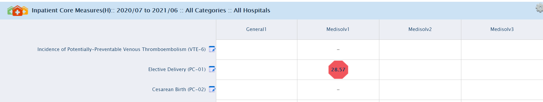
Hospital Scorecard (Multiple Hospital)*
You can view the performance of each indicator in the different hospitals within your purview by clicking on the Hospital Scorecard. A similar color coding signifies the performance of each indicator. This feature can be viewed only in the Multiple Hospital module in Encor Dashboard.
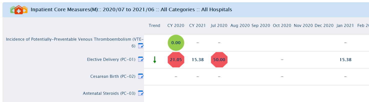
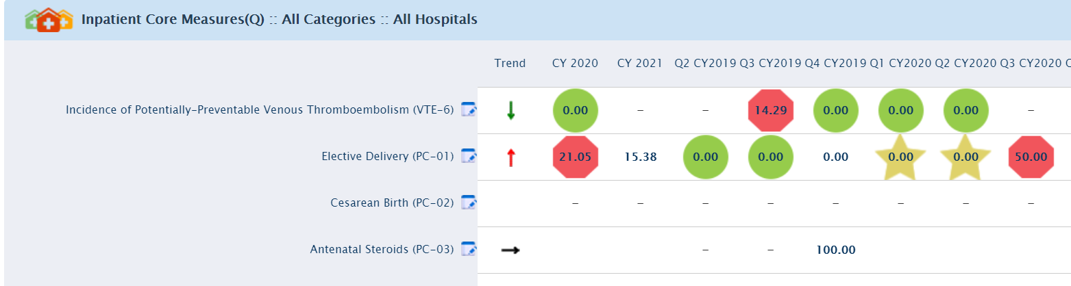
Quarterly Scorecard*
Quarterly Scorecard view displays quarterly data for the current quarter and the previous 8 quarters, in a color coded report card format.
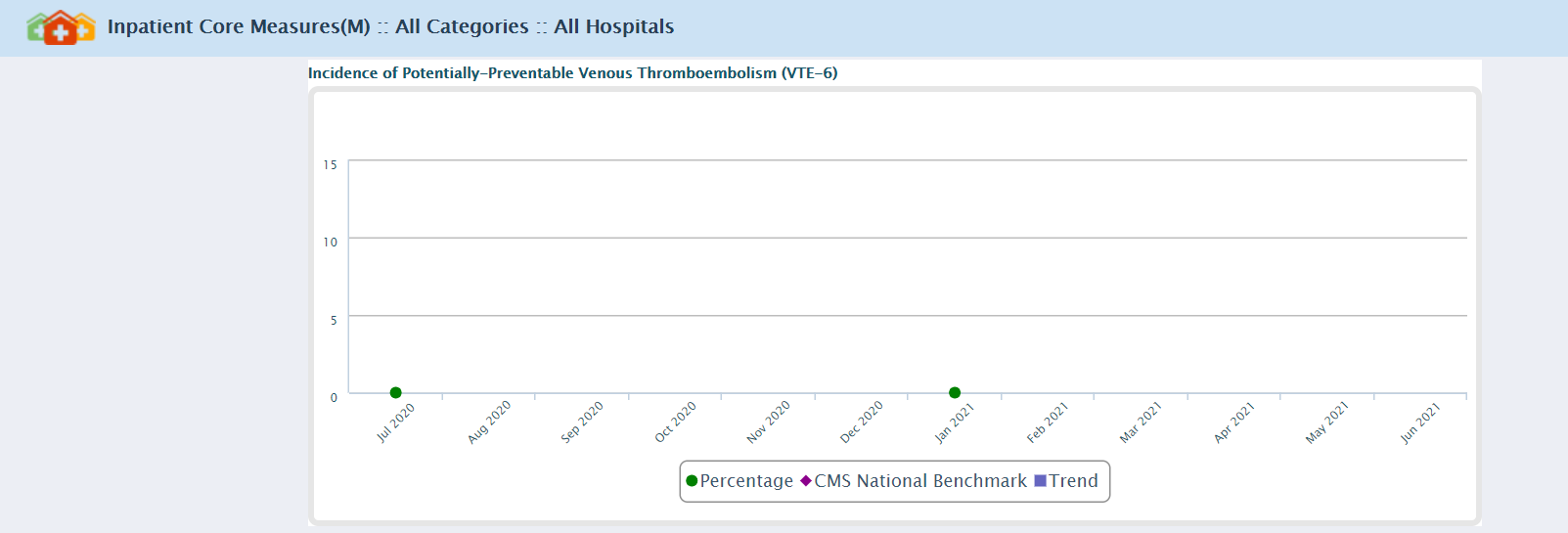
Monthly Graph*
Monthly Graph view displays monthly data for the current month and the previous 11 months, in a graphical format. The Settings (Gear) menu in this view enables the graph to be exported to SVG format.
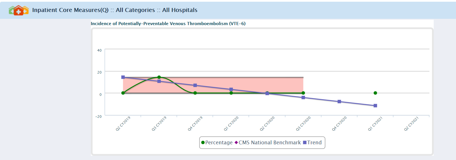
Quarterly Graph*
The Quarterly Graph view displays quarterly data for the current quarter and the previous 8 quarters, in a graphical format. The Settings (Gear) menu in this view enables the graph to be exported to SVG format.
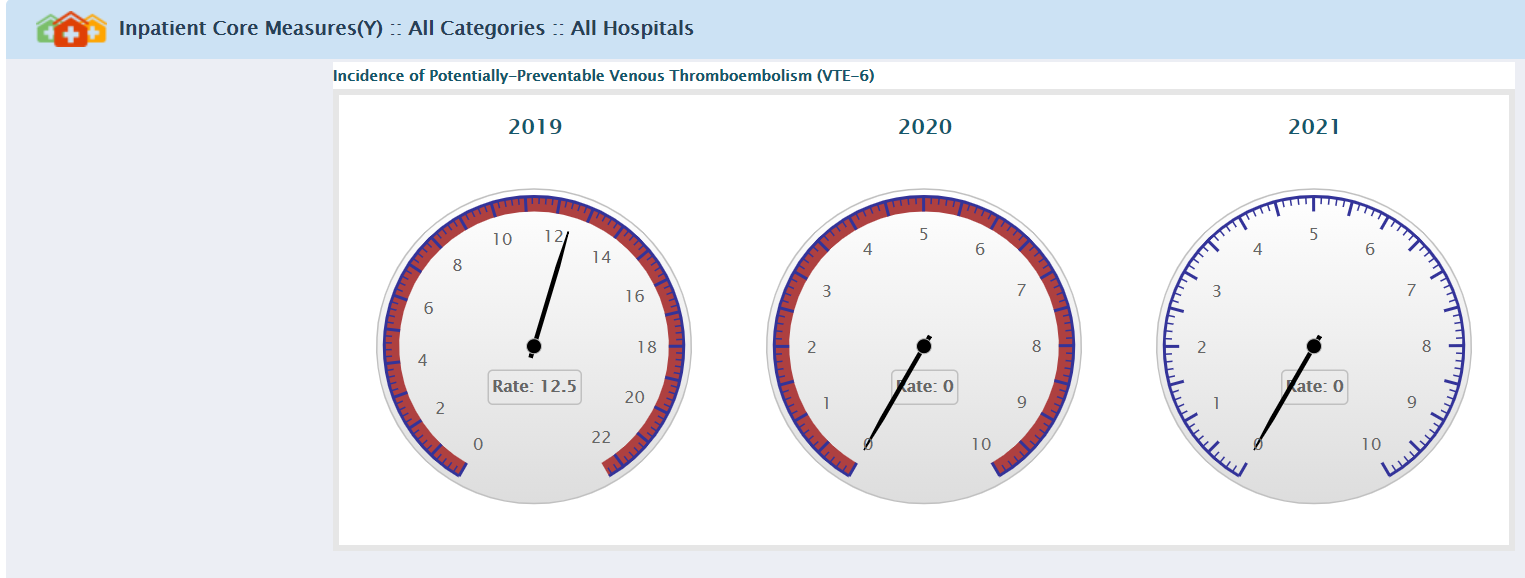
Yearly Gauge*
You can also view results in the form of Yearly Gauges. The Yearly Gauge view displays annual data for the current year and the previous 2 years, in a color coded gauge format.
Change Dashboard
Clicking on the Change Dashboard option under the Settings (Gear) menu, displays the Dashboards pop-up.
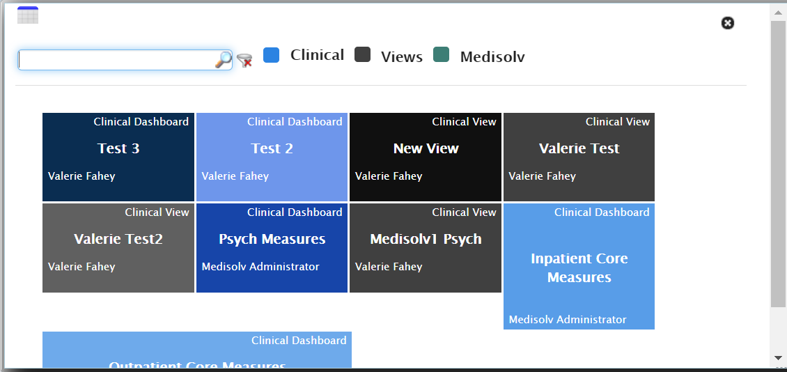
The dashboards are arranged by order of the frequency of use by the logged in user, i.e. the dashboards used most frequently are displayed higher in the list; dashboards used less frequently are displayed lower in the list.
Click on a Dashboard name from the pop-up to change the grid display to the dashboard you selected.
The dashboard you select is displayed in the default view that has been set in its properties.
Change Period*
Allows the user to change the display period on the dashboard.

The Date Range displayed cannot exceed 12 months.

Category Filter*
Each indicator set up for the organization falls under categories like Patient Safety Indicators, Meaningful Use Indicators or Quality Indicators. To change category, click on Category Filter option under Gear Wheel menu, this action displays the Category popup window.
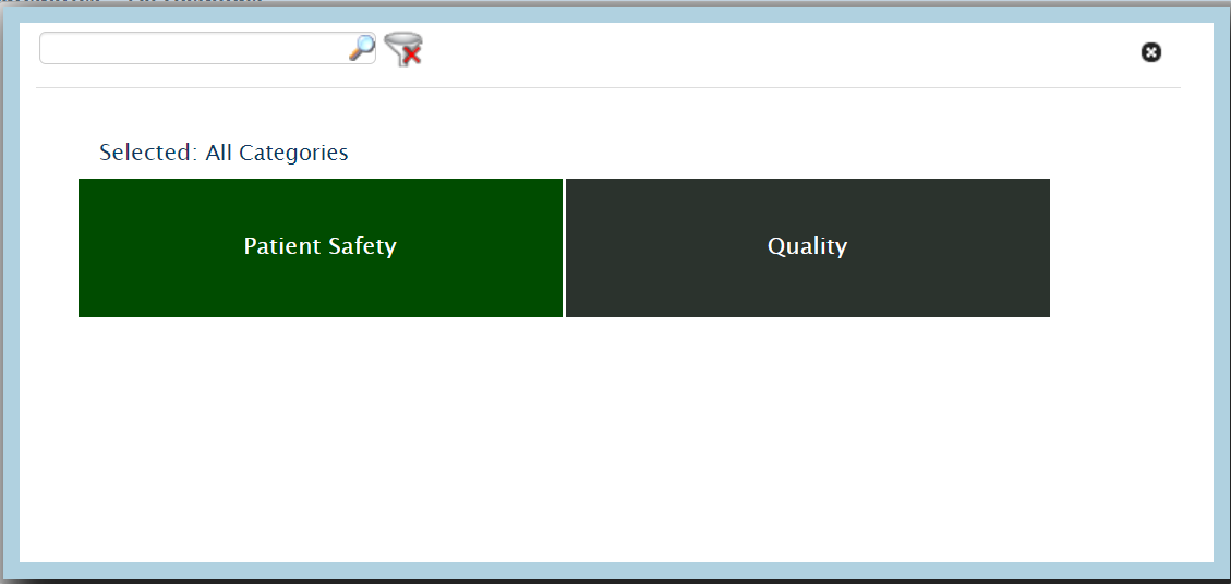
On the Category filter popup window, you can enter a partial or complete phrase in the textbox to filter the Categories list or select the category from the listed categories on the popup. The searched or selected Category is filtered instantly to display only the category whose names contain the entered phrase.
Example: If you enter "Patient" in the filter textbox, all indicator categories that contain the word "Patient" in their names are displayed.
Selection of a category displays the sub-categories under it. Clicking the Back button enables viewing the category list again.
Please note that only one Category or Sub-Category can be selected at any given time.
If a Category/Sub-Category was selected for generating the dashboard, the Category dropdown is displayed with a checkmark before it to indicate that the filter was applied. A breadcrumb trail next to the dashboard name hints that a category filter has been applied.
To clear the filter, select Clear Filter option under Gear Menu or select Clear Filter icon in the Category Filter popup.
Hospital Filter*
You can view the performance of a specific hospital within your purview. To view the hospital performance select Hospital Filter from gear menu. A popup window will open, select the Hospital Name and click on the Apply Filter to view the selected Hospital details. A similar color coding signifies the performance of each indicator, this feature is only available for the multiple hospital modules.
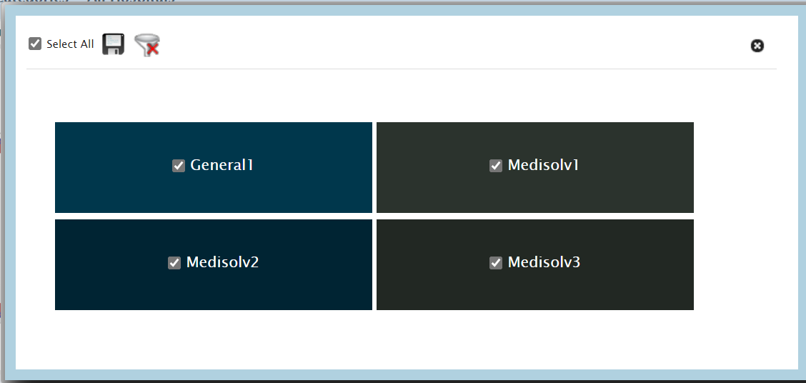
Hospital Filter option is only available for Clinical Dashboard.
Clear Filters*
Click on the Clear Filters option to remove any Category Filter or Hospital Filter applied on the Dashboard.
Export To PDF/Excel*
The Export To PDF/Excel option allows you to choose a format to export the data on the screen. Enter any desired notes in the text box and click the desired export - PDF or Excel.

Export to SVG*
This option is available for the Monthly Graph and Quarterly Graph views. You can export the graph you view on screen to a SVG (Scalable Vector Graphics) format. No pop-up is received, the SVG is generated as a download and opens a new tab in the browser when it is clicked.
Send Email*
With the Send Email option, you can choose recipients to send the dashboard data to, and also request a copy to be sent to you. Select the recipients from the To: list and click the e-mail icon.

Set As Default*
You can select the dashboard you would like to view on the Dashboard by selecting the Set As Default option. The next time you view the Dashboard page, the dashboard you set as default is displayed.
Reset to Default*
Select the Reset to Default option to remove the default dashboard.
Set Benchmark As Goal*
ENCOR-D enables you to temporarily Set Benchmark As Goal and view how the hospital scores measure up against the set goals. The values from the first benchmark are set as goals. Color codes are assigned against these values and the dashboard is re-displayed. If there are no benchmarks set, the display does not change. The menu option toggles to Remove Benchmark As Goal once the benchmark has set as a goal.
Remove Benchmark as Goal*
You can remove a benchmark which has been temporarily set as a goal. If you select Remove Benchmark As Goal from the gear menu, or refresh the page the color codes revert to what they were before the benchmark was applied as a goal. Once the benchmark is removed, the menu option toggles to Set Benchmark As Goal.
Hide Empty Indicators*
On the dashboard, indicators with no data available are displayed as empty lines. To have an uncluttered view you can hide the empty indicators by clicking on Hide Empty Indicators on the Settings menu. The menu option toggles to Show Empty Indicators once the empty indicators are hidden from view.
Show Empty Indicators*
Click on the Show Empty Indicators on the Settings menu, to view the dashboard with empty indicators. Once the empty indicators are displayed on the dashboard, the menu option toggles back to Hide Empty Indicators.
Hide Decimal*
In order to view the Indicator values without their decimal values, click on the Hide Decimal option on the gear wheel menu. The menu option toggles to Show Decimal once the decimal values are hidden from view.
Show Decimal*
You can view the Indicators with decimal places in their value, by clicking on Show Decimal option on the gear wheel menu. This menu option toggles to Hide Decimal once the values of the Indicators are displayed with decimal places.
Save Current View*
ENCOR-D gives you the option of saving the current view. This option is useful if specific filtering criteria has been set or to have views of your preference. By saving a view as private, you can restrict viewing privileges to yourself. You can also save a view as public in order to share it with others in your organization.
* The display of the above options are subject to the current view selected.